"Visuals express ideas in a snackable manner.” – Kim Garst, Boom Social
Creating visual content can take a lot of time out of your day. It's a lot easier to publish a few quick bits of text or the odd quote than it is to create an attractive image, tailor-made to the tastes of your audience. Yet savvy marketers all over the world spend dedicated time each week putting together the perfect piece of visual content. Why?
Well, it boils down to one simple fact: Visual content works.
So much so, that studies have shown that whilst 10% of people are likely to remember something they've heard three days later, that percentage grows to an incredible 65% when that information is paired with an image. (Source)
The numbers get even sillier when it comes to giving instructions – people do a whopping 323% better at following directions when those directions are coupled with some kind of illustration. (Source)
So, in short, it's absolutely worth it to spend time creating visual content for your audience and, more importantly, learning how to create good visual content. After all, it's what you're going to be remembered for.

The Good News…
…is that using the brandable, done-for-you content from Content Sparks means half the work is already done for you.
Not only can you cut down on the time it takes to create ace visual content, you can happily get on with other things while your competitor is still searching for ideas. That's because all the information you need to put into your visual content is already at your disposal in your Content Sparks content.
Creating visuals to complement your course content will set you apart from everyone else, help your students learn faster and retain what they learn, and give you additional content for marketing your courses.
Here are a few ideas for how you can take your brandable content to the next level with visuals:
- Get the Facts. You can pull the most important points from your content, (this could be anywhere from 3 or 5 to 20+ points, depending on how broad you'd like your focus to be) and use them to create a variety of different types of visuals, such as:
Tips images – Create a shareable, interesting and relevant image to accompany each point in a quote-type format. Release each one in sequence to encourage people to find out more.
Infographics – Create a breakdown of everything covered in one simple overview infographic. You'll show people what's covered in your program which will leave them wanting more.
Slideshows – Put together a taster slideshow with interesting images on each slide to cover each point of your course. Once again, you'll be inviting your audience to get involved.
- Think Numbers. Work through your content and pull any statistics involved to create graphs. Presenting difficult to remember parts such as numbers in a visual format works not only as a learning aid, but also another excellent opportunity to promote your course.
- Make it Personal. Use photographs that your audience can relate to as a way to make your content more dynamic and memorable. For example, if your target audience is 65+, include visuals that apply your topic to that age group. That will help them relate to the content while reminding your audience of what you can do to help them personally.
- Take it Step-by-Step. As we mentioned, adding illustrations to directions can have a huge effect on how that information is digested, (just imagine trying to do Yoga for the first time with written instructions). If you're teaching your audience how to do something, show them as well as telling them. They're much more likely to understand, and might well refer to your instructions every time they perform that task from then on… not to mention sharing your steps with friends/family/colleagues who'd like to learn the same thing.
Whenever you create visual content in any format it's important to think about the quality of what you're producing. You need to make sure that anything you add to your content will enhance your audiences' experience, not give them a headache.
Here are a few guidelines for creating visuals for your brandable content from Content Sparks:
- Make it big. Make sure all visuals added to your course book are large enough to remain clear. You want to make sure that your audience can see what's in an image both on and off screen when printed so bear both formats in mind.
- Avoid blurry images. Again, your audience needs to be able to see what's in an image to really make the most of it. Blurry images are a little off-putting and look unprofessional.
- Think about the future of your content. A great example here could be to later repurpose your slideshow as a video that you can then upload to YouTube for promotion. Create your slides with YouTube sizing in mind, (1280px X 720px or 1920px X 1050px for HD) to avoid having to edit everything in the future.
- Crop, don't stretch. Where possible, it's always a good idea to make key images as large as you can. This can mean making an image the same size as an entire slide, or cover a page of your course book. When you resize images, make sure that they're not distorted. If they don't fit quite right, it's better to crop some parts instead of stretching an image to make it work… just make sure you don't cut out any important bits!
- Make it memorable. Whatever you do, make sure it stands out. Your audience is much more likely to remember a unique image than something they've seen a thousand times before. Especially for teaching, creating unique visuals that people will remember will help them remember your content too.

Marketing Visuals
When it comes to creating visual content for marketing, you first need to know where you audience is before creating the right content type. Once you know where you'll be reaching them, you can create the perfect content for that particular platform. Sites like Facebook, Twitter and Instagram use specific sizing for visuals, and you'll want to make sure what you publish doesn't end up squished or distorted by planning ahead.
Here are some of the most popular content types, along with their standard sizes for 2023, so you can get started right away…
Profile Photo: | 170 x 170 |
Cover Photo: | 851 x 315 |
Posts & Timeline Photos: | Landscape: 1200 x 630 Portrait: 630 x 1200 Square: 1200 x 1200 |
Stories: | 1080 x 1920 (9:16) |
Event Cover Photo: | 1200 x 628 (2:1) |
Profile Photo: | 400 x 400 |
Header Photo: | 1500 x 500 (3:1) |
In-Stream Photos: | 1600 x 900 |
Instagram:
Profile Picture: | 320 x 320 |
Image Thumbnail: | 161 x 161 |
Feed Photos | Landscape: 1080 x 566 Portrait: 1080 x 1350 Square: 1080 x 1080 |
Reels: | 1080 x 1920 (9:16) Cover photo: 420 x 654 |
Carousels: | Landscape PX: 1080 x 566 (1.91:1) Portait PX: 1080 x 1350 (4:5) Square PX: 1080 x 1080 (1:1) |
Stories: | 1080 x 1920 (9:16) |
LinkedIn:
Profile Photo: | 400 x 400 |
Profile Cover Photo: | 1584 x 396 (4:1) |
Shared Link Images: | 1200x 627 (1.91:1) |
Company Logo | 300 x 300 Square: 60 x 60 |
Page Cover Image: | 1128 x 191 |
Life Tab Images: | Main Image: 1128 x 376 Custom Modules: 502 x 282 Company Photos: 900 x 600 |
Pinterest:
Profile Photo: | 165 x 165 |
Profile Cover Photo: | 800 x 450 (16:9) |
Pins: | 1000 x 1500 (2:3) |
Collection Pins: | 1000 x 1000 (1:1) |
Story Pins: | 1080 x 1920 (9:16) |
YouTube:
Profile Photo | 800 x 800 |
Banners: | 2048 x 1152 (16:9) |
Video Thumbnails: | 1280 x 720 (16:9) |
IMPORTANT: If you want to add photographs to your visual content, it's essential that you have the rights to distribute any images you use. This means either sourcing ‘free for commercial use' images, or purchasing a license for anything you use.
For free images:
For paid images:
And there you have it. All you need to do now is put finger to mouse and get started!
If you're struggling for ideas for what to create, take a look at what your competition is producing and learn from, (but don't copy!) them. Visual sites such as Pinterest are also always really helpful when it comes to inspiration.
The more you produce visual content, the better you'll become at creating it, so spend some time playing with different tools and ideas. Don't limit yourself – you're going to need your imagination to create the best content possible!
Want a handy reference sheet for the tips and image sizes from this post?
We've pulled all the important bits together into a downloadable PDF that you can save and refer to whenever you like. Just click below to access…
Want to learn and teach others how to create a content marketing plan that they'll actually use?
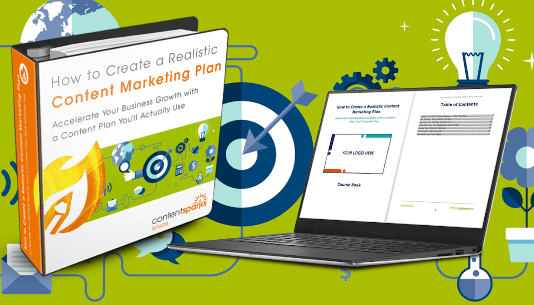
How to Create a Realistic Content Marketing Plan
Teach Yourself. Then teach your audience.

When you purchase a license to any of our ready-to-go course kits, you get the rights to edit it any way you want (or leave as-is) and add your own name and branding.
Then use your new course to:
- Attract new clients and customers (such as with a free training, webinar, or eCourse)
- Add a new stream of income (such as with a paid course or workshop)
- Keep your current customers successful and coming back for more (such as with bonus webinars, videos, and other learning resources).
Enjoy!

Tags
