Did you know that there's one snippet of text on your page which can determine the entire future of your business?
Well, perhaps it's not quite as dire as that, but pretty darn close. And learning how to write call to action phrases on buttons that people want to click on should be near the top of your copywriting skill list.
Why? Because your website visitors can't read your mind. They don't know exactly what they should do next unless you tell them. And they won't know where to click, or that they should click at all, unless you show them.
That's the whole point of a ‘Call to Action' button and the call to action phrase that you put on it. But first, let's take a step back, in case you haven't heard the term before.
What is a Call to Action?
Also referred to as a CTA, your call to action quite literally tells people what action they should take next.
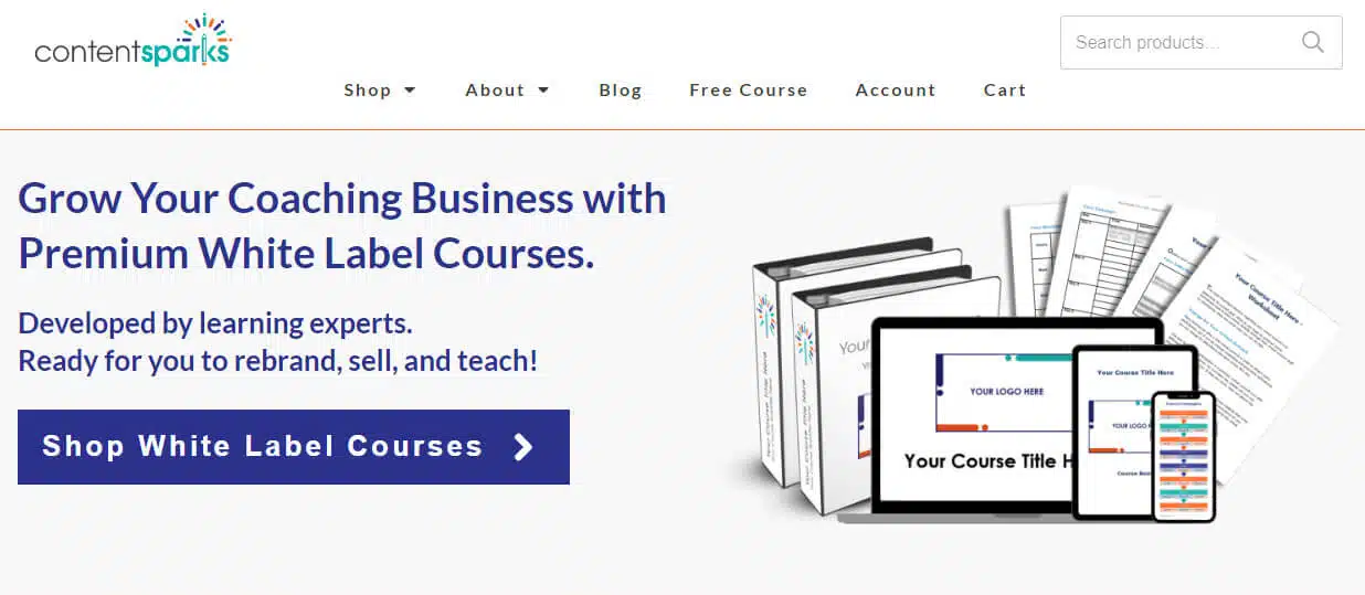
Usually, your CTA is shown on a clickable button on a page, though it could also be some hyperlinked text, such as in an email. For example, here's what the CTA looks like on our Home Page to encourage people to visit our Shop:
Without a CTA, visitors are left to wander on their own, click to other pages, or just leave. But when you plan out specific goals for each page or each piece of your content, you can guide your visitors and readers along a logical path of action.
That doesn't mean that your CTA is always about a sale or opt-in. You should have a variety of actions that lead people through the stages of your sales funnel and beyond.
For example, you could have calls to action like:
- Watch the video to learn how (to get people to watch a tip or tutorial video)
- Contact me today (to invite new prospects to start a conversation)
- Find out how you scored (to send people their quiz results)
- Download your free template now (to encourage them to opt-in for your lead magnet)
- Start creating stunning graphics (to get people to buy your graphics software)
- Get exclusive member access (for a membership sign-up)
- Reply to this email to save 15% (ask people to reply to your email, for a coupon)
Those phrases are all calls to action. And they all have a few things in common.
Call to Action Phrases: Formula and Examples
When you write your own call to action phrase, the specifics of your wording are going to depend on your goal and what else is on the page. But when I looked at a variety of call-to-action examples, there were a few themes that appeared. And these can be summed up in a general formula.
Generic CTA = Verb + Time
A generic call to action could be
- ‘Download Now',
- ‘Buy Today', or
- ‘Get Immediate Access'.
However, the more interesting and higher-converting CTAs include one or more of the following:
Add Personalization
Use words that make the viewer feel they are the ones taking the action, by adding you, your, I, me, or my. For example:
- Send my free template now
- Get your 30-Day free trial
Show Value
By attaching a value or benefit to the CTA, you raise the stakes for people who might be tempted to ignore it. Make it sound worth their while. For example, the word ‘Free' is popular because is conveys that they're getting something for nothing. But you can make ‘free' more valuable or use words that communicate other benefits. Such as:
- Sign up for a free strategy call – Limited spots
- Start seeing higher conversions
- Send me updates about new offers
Give Specifics
You may already be seeing another theme here, and that's the need to be specific about what people will get. It's ok to use a simple CTA, like ‘Download Now', if the copy around it is extremely clear about what they get. However, it still pays to make it obvious, in as few words as possible. For example, here are short CTAs that still tell people what to expect after they click:
- Send my free proposal
- Start the free software demo
- Attend the next webinar
- Show me how it works
- Add to Cart
That last one, like ‘Buy Now', is tried and true for shopping sites. And it also shows that some CTAs work just because people have seen them so often that they know what to do automatically.
However, don't assume that what works for one business will work for you too! Also, you don't know if that competitor of yours who has ‘act now' on all their CTAs even has any statistics on their conversion rate.
How to Write a Call to Action
Start writing your call-to-action by answering these two questions:
Question 1 – What is the #1 action I want my visitor to take on this page?
This first question will help you figure out your ‘verb' for your CTA. For example, if you want them to request a free strategy call with you, you know you'll need a verb like ‘contact' or ‘schedule'. If you want them to register for your webinar, then you'll need a verb like ‘register', ‘attend', ‘reserve', etc.
Question 2 – What benefit will they get by taking that action?
The second question is the juice that powers the best calls to action. Pull yourself out of the equation entirely and think about why someone should do what you're asking.
Sometimes, the answer is obvious right away – such as the free PowerPoint template that's going to make their next slide show look snazzy and modern.
Other times, you'll have to delve a little deeper. For example, why should people call you for a free strategy call when it's going to take time out of their day and they know you'll probably try to sell them something? Hopefully, it's because you plan on giving them one immediate action they can take, or some other insight.
SIDE NOTE: Answering these two questions helps with writing all the rest of your copy on the page and around your call to action too.
Answered those CTA questions? Ok, now it's time to play with words.
I've pulled together a list of some starter words in different categories that you can combine in various ways to spark new CTA ideas. After that, you'll also see some more examples of call-to-action phrases for a few common scenarios.
Verbs:
- Start
- Learn
- Find Out
- Download
- Get
- Click here
- Send
- Join
- Sign Up
- Claim
- Talk
- Tell
- Buy
- Request
- Explore
- Register
- Attend
- Watch
- Listen
- Claim
- Reserve
- Save
Time and Scarcity (if relevant):
- Now
- Immediate
- For X Days
- Unlimited
- Limited Supply
- While Supplies Last
- Only X Days Left
- Closing Soon
- Last Chance
- Hurry
- Today Only
Value:
- New
- Free
- Unlimited Access
- Free Access
- Free Trial
- Special
- Guarantee
- Limited Spots
- Exclusive
- Members Only
- Results
Now, try combining a few words to come up with variations of your call to action. As you do that, remember:
- Ultimately, your CTA is NOT about your product or service. It's about the benefit your visitor is going to get by taking action
- Be specific about what will happen after they click
- You can be subtle in your wording, but not so subtle that your visitor doesn't realize they're supposed to do something!
- Be aware of the context for your CTA. Some calls to action need to be more direct than others, such as the ‘buy now' button on a sales page. Others should be more of an invitation to learn more, for example the CTA on a piece of content earlier in your customer's buying journey.
Examples of Call to Action Phrases for Different Situations
Speaking of context, take a look at some of the examples of CTA phrases that you might use in different types of content. See if you can tell the difference in tone.
Calls to Action for Content Marketing:
- Read More
- Watch the Video Now
- Listen to the Podcast
- Check out our most popular posts
- Find out how
Calls to Action for Lead Magnets:
- Join Today to Get Free Access for 30 Days
- Send Me Specials Now!
- Download Now
- Claim Your Free Trial
- Start Your Free Trial
- Join Free for a Month
- Sign up for free
- Request a Free Demo
- Send My Free Proposal
- Get the Guide/Report/Cheatsheet etc (whatever you’re giving)
- Sign Up. It's Free!
- Attend the Webinar
- Claim Your Spot
Calls to Action for Home Pages:
- What We Do
- Continue
- Learn More
- Click Here for (category or topic)
- Contact Me
- Give Us a Call
- Explore Our (site, platform, software, services, etc)
- See What’s New
Calls to Action for Sales Pages:
- Click Here to Get Started
- Unlimited Access for $X (your special offer price)
- Give X a Try (where X is your product or service)
- Buy Now
- Shop Now
- Add to Cart
Calls to Action for Email:
- Sign Me Up
- Send Me Updates
- Tap ‘Reply' (for inside an email)
NOTE: For newsletters, never use the word ‘Submit'! That's a default on some email forms. If you change anything, change that.
More Call to Action Examples
Need more inspiration? Here are some other examples where companies have gotten creative with their CTAs.
[Note: Businesses often change their call to action to test out which ones work best. So these examples may not look the same when you visit the page.]
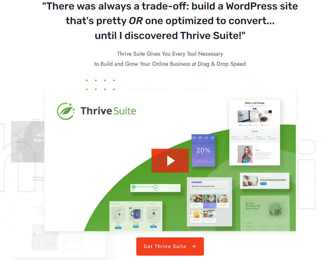
Thrive Themes' home page CTA is about as specific and obvious as you can get. Visitors are hooked by the headline and directed to get the product, which leads to more specific information on another page.
Go Daddy is also specific, and they put a CTA inside the text box plus on their button:

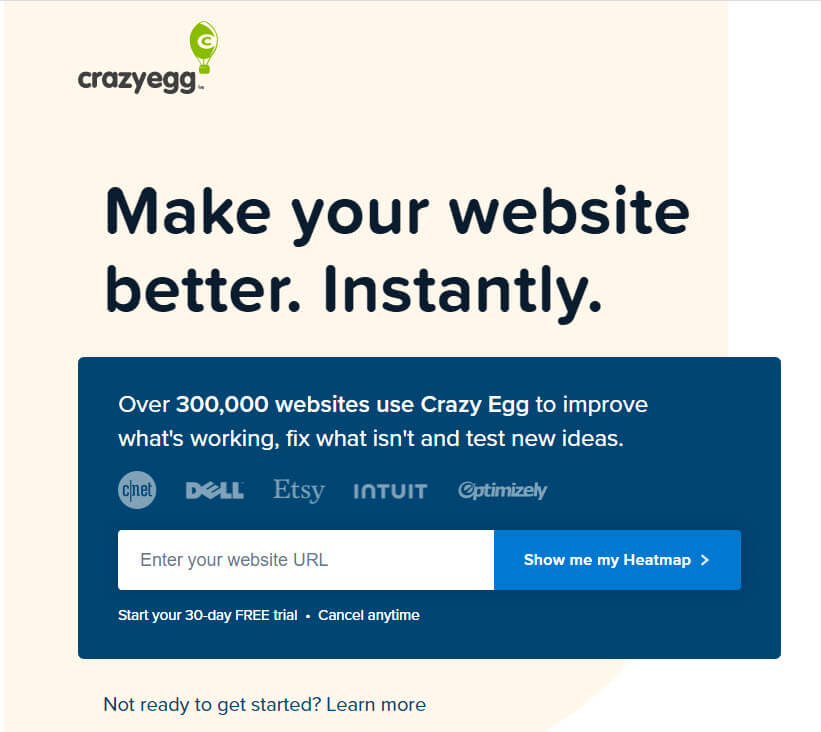
Crazy Egg manages to be specific, but using very few words on their button:
Have some ideas for your Call to Action Phrase now?
Great! Now you need a button graphic to put it on.
Call to Action Button Examples and Tips
A lot has been written about call to action buttons, including testing them every which way possible. Blue, green, orange; big, bigger, biggest; 3D, flat, shadowed; fade-in, bounce-in, rotate and pop. You name it, and someone has tried and tested it.
But, you really don't need to worry about testing and scientific methods right now. That's for after you're getting a lot of traffic and have enough visitors for a test to show any significance.
For now, when you're creating your button, follow these tips and use the examples for inspiration….
[Note: Like with the CTA phrases, businesses often test out different styles and colors. So if you click through to the examples, they may not look the same.]
Tip 1. Pick a color that stands out on your page.
If your call to action isn't clearly visible, at a glance, it's guaranteed to fall flat. One thing you don't want your visitors to do is search for a place to click. If it requires searching, most people will just leave.
Here's an example of a button that used to be on Instapage's home page that clearly stands out, where the color of the button contrasts with the rest of the page:

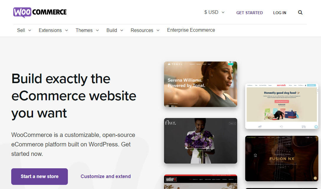
The WooCommerce button only needs to be purple to stand out on their white background:
Tip 2. Include one main button above-the-fold and one secondary one further down the page
When people arrive on your page, they may not scroll down at all. So whatever they see on their screen should be the most important information you want to convey PLUS your CTA button.
If you've attracted the right visitors, many will click on that top button right away.For those who need to read more, include another call to action button further down your page – at the bottom, or even an extra in the middle if the page is very long.
But don't bombard people with buttons. That's distracting at best and annoying at worst. And, if you have a very complex product, you may want to test just having your CTA further down the page, after people have had a chance to read a bit more.
Here's an example of Hubspot's home page, where they have very clear, obvious CTA buttons at top and bottom:
Top of page CTA:

Bottom of Page:

Tip 3. Leave white space around the button
Color isn't the only way to make your CTA button stand out. Make sure there's enough space around each side, so that your visitor's eyes aren't pulled to nearby text or images.
Here's what I mean by a button without enough white space:

To me, the old Techsmith button seems small, it doesn’t really stand out, and there's a lots going on in background that pulls my eyes away. Of course, we don’t know if they tested it, so it could actually be working for them! But considering they've changed it since I took this screenshot, probably not.
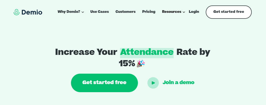
On the opposite side, here's one from Demio that has just the right amount of space around the button, including a stand-out color and placement above-the-fold, front and center:
Tip 4. Keep it short on words and big on size
There are certainly examples of long call to action phrases on buttons, and you have to hope that those were tested to convert. But most of the best CTA examples are short phrases put on large buttons. The font needs to be big enough to read at a glance, while the button needs to be big enough to see on the page.
Here are a couple example of nice, big, stand-out CTA buttons with short phrases and clearly visible buttons:
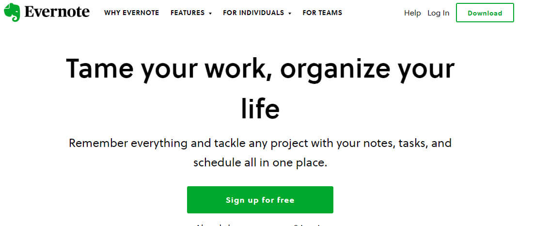
Evernote's green button on white background draws the eye in. The ‘Sign up for free' tells you exactly what you'll get.
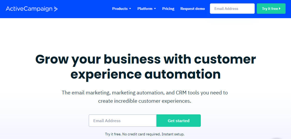
ActiveCampaign also uses a green button, this time on an opt-in form with even fewer words. The invitation under the form, "Try it free", make the action easy since the word ‘try' clearly doesn't mean a commitment.
Tip 5. Make it look clickable
Internet users are already trained to click on buttons that are rectangular or with rounded edges like these:

Neil Patel's previous home page is a great example of giving people the option of saying Yes or No, so you can get more targeted leads.
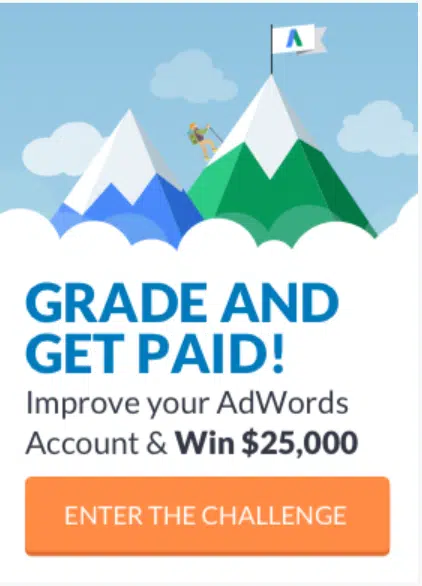
WordStream used to have an enticing opt-in for a Challenge in their sidebar, with a very clear CTA to 'Enter the Challenge'. No doubt about what you're doing when you click that.
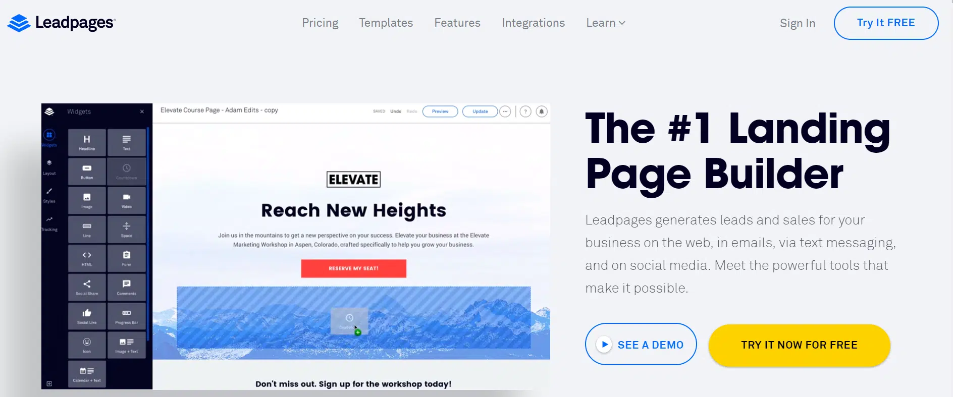
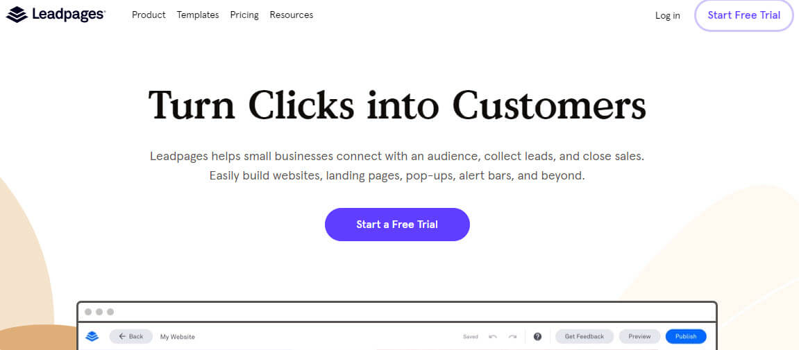
And LeadPages also used to give two options, but it's pretty clear which one they'd prefer you to click on, since the yellow color stands out more. They've since changed it to one CTA with an even bolder color, telling people to just 'Start a Free Trial'.
If you try to get to fancy with your buttons, using things like badges and interesting shapes, your page may look sensationally stylish. But, you may also leave your visitors confused about what to do next.
Your best bet? Stick with what already works for the majority of websites.
You can purchase pre-designed CTA buttons in a variety of styles, so don't worry if you don't have the graphic skills needed. In fact, you could even create a button graphic in your PowerPoint software, if you feel the urge.
Or, try a tool like Button Optimizer to generate a button with the color, text, and size you need. Then download the CSS or a png image to use.
Depending on where you're putting your CTA, many page-building tools will give you different button options. That doesn't mean they're the best to use. You still need to make sure you follow the above tips for creating a call to action button.
Ok, so now you have a Call to Action phrase that's going to inspire and encourage your visitors to do what you want them to do.
And, you have the key guidelines to follow for creating a CTA button for your phrase.
It's time to combine them and get your call to action in front of the right eyes.
Not sure if you have the best CTA? If this is the first call to action you're writing for a particular piece of content, you won't get it right the first time.
Do the best you can, following the tips in this post, and then wait until you have a significant number of visitors to the page before you worry about tweaking or testing your CTA. Your time is better spent driving traffic and working with customers.
Want a worksheet to guide you through creating your Call to Action Phrases?
Want to learn and teach others how to write sales copy that converts browsers to buyers?
Conversion Copywriting Workshop
Teach Yourself. Then teach your audience.
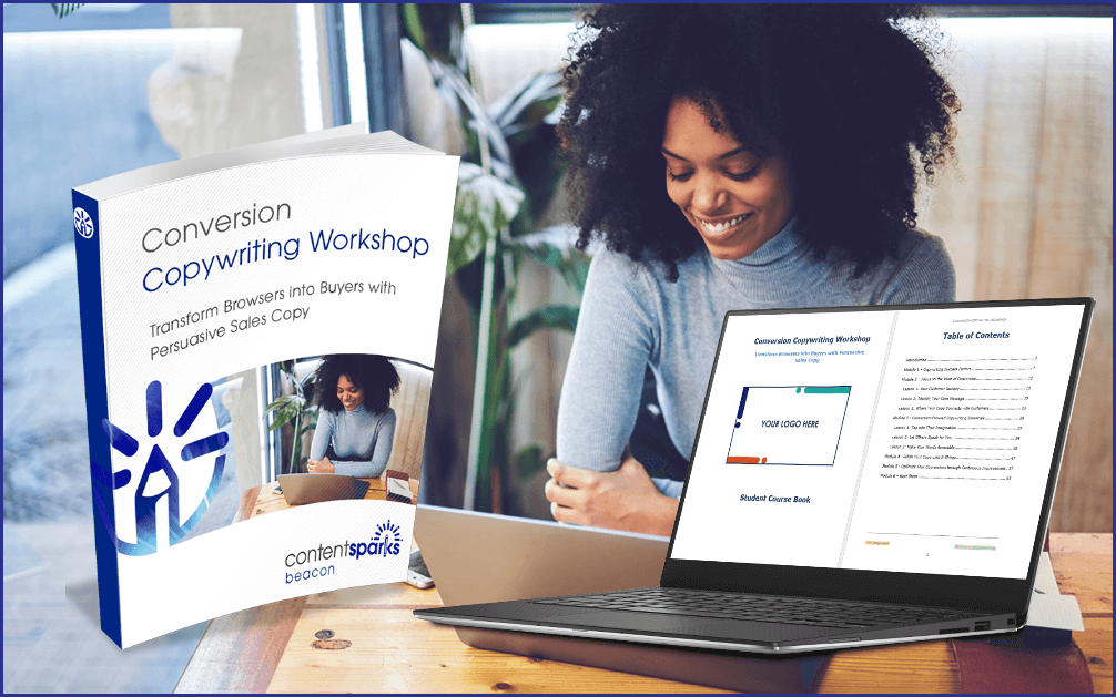
When you purchase a license to any of our ready-to-go course kits, you get the rights to edit it any way you want (or leave as-is) and add your own name and branding.
Then use your new course to:
- Attract new clients and customers (such as with a free training, webinar, or eCourse)
- Add a new stream of income (such as with a paid course or workshop)
- Keep your current customers successful and coming back for more (such as with bonus webinars, videos, and other learning resources).
Enjoy!

Tags
You may also like
Comments are closed.

The CTA Call To Action is often overlooked, you have to get them to take the next step. And after they take that step lead them to the next. Never be afraid to ask for the next step. People will appreciate being informed. That is what the CTA does, it leads your customer to an informed decision, if you do it right, and I’m sure you will! Thanks for the great article.